Introduction to Statistics: What Do Graphs and Charts Tell Us?
HomeIntroduction to Statistics: What Do Graphs and Charts Tell Us?
Published:
10.01.2024
Statistics comes off as a complex topic but it’s really just about finding patterns and comprehending data. It helps us make sense of the world by identifying trends, correlations, and differences in information. You can analyze sports scores, election results or science experiments with statistics as the tool to understand what the data is truly telling us. One of the main ways it does this is through graphs and charts.
Graphs and charts unlock what is in the data and help us draw conclusions from numbers. By providing a visual representation of data, graphs and charts make it easier to interpret and extract insights. By transforming raw data into a more digestible format, we can uncover trends, patterns, and key conclusions that might otherwise remain hidden in that information.
What is Statistics?
Statistics is the science of collecting, organizing, analyzing, and interpreting data. When we think of data, we think of numbers or information. Raw data alone does not tell us much at all. For example, a list of the ages of 200 students in your school wouldn’t be very useful until you organize it in a way that shows patterns or trends. This is where statistics comes in. Techniques like averages, percentages, and comparisons will help you find meaning in this data. To make sense of numbers, one of the best tools we can use is a graph or chart.
Why Use Graphs and Charts?
Imagine trying to explain a pattern in data using only numbers and text: confusing and time-consuming. With graphs and charts, you can visualize the information in a way that’s easy to understand even if you only have a moment to glance. Graphs and charts turn data into visual stories, allowing us to identify patterns, compare information, and find differences. They help transform complex data into something that can be understood more easily, making it quicker to identify important trends, relationships, and outliers.
Types of Graphs and Charts
There are several types of graphs and charts, each suited to different kinds of data and purposes. All look different visually but that is what makes them beneficial and important to understand.
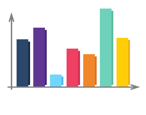
Bar Graphs
Bar graphs are used to compare quantities across different categories. In a bar graph, each category is represented by a bar, with the height or length of the bar representing the quantity in that category.
For example, if we survey a group of people on their favorite type of movie (comedy, action, romance, drama, or sci-fi), the height of each bar would show how many students prefer that movie type. The taller the bar, the more students like that movie type. Bar graphs make it easy to compare categories side by side and are a great way to highlight differences in data.
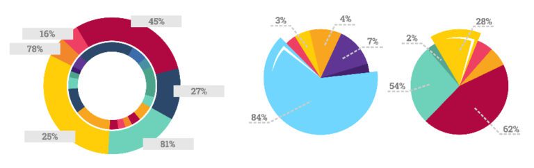
Pie Charts
Pie charts are used to show parts (or percentages) of a whole. They are divided into slices that represent percentages or proportions of the total data.
Let’s take the same example above and put it into a pie chart. The size of each slice would represent what percentage of students like which movie type. Now we will see that the 4 students who like comedy are actually 20% of the total students surveyed.
Pie charts are useful when you want to show how different parts make up a whole and are especially helpful in highlighting proportions.
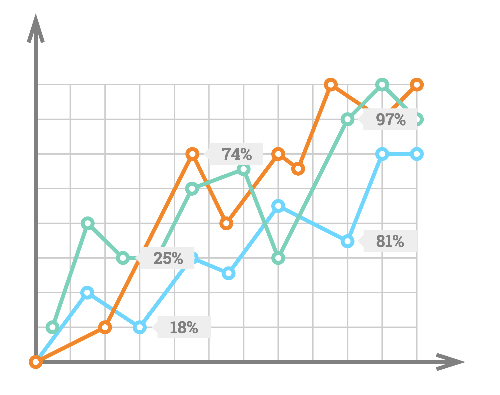
Line Graphs
Line graphs are the best way to show trends over time. In a line graph, data points are plotted on a grid and connected by a line. This graph type is especially useful in tracking changes over time, such as the number of students who enroll in a school from year to year, or the rise and fall of temperatures over a year.
Let’s take one of the examples mentioned: number of students who enroll in a school from year to year. From the years 1989 to 2020, the number of students enrolled would be plotted using dots for every year, and then connected from left to right using a line. This line would help you see if enrollment increases, decreases, or stays the same over time. This kind of information could help identify any trends in enrollment and create or support a hypothesis as to why enrollment increased and decreased.
Scatter Plots
Scatter plots are used to examine the relationship between two variables. Each point on a scatter plot represents an individual piece of data, with one variable on the x-axis (vertical) and the other on the y-axis (horizontal).
For example, you could use a scatter plot to see if there’s a relationship between the temperature outside and a day’s sales in a store. By plotting the temperature and the corresponding sales that day, you can see what temperature could be related to higher or lower sales. In this scatter plot, we can see that warmer temperatures mean higher sales, suggesting a positive relationship between the two variables (Temperature and Sales).
Histograms
Histograms look alike to bar graphs but are used to show the distribution of data. They are commonly used to show how often ranges of values appear in data. For instance, if you conducted a survey asking students their height in inches, you can use a histogram to show how many students fall in which height range (51-55, 56-60, 61-65, 66-70, 71-75, and 76-80 in.) Each bar in a histogram would show how many students fall into each specific range, helping you see patterns in the data. It’s important to note that this is different from a bar graph because a histogram shows a range of data versus categories in a bar graph.
How to Read a Graph or Chart
After seeing each type of graph or chart that is used in statistics, it’s crucial to understand how to read them. While a pie chart is self-explanatory, the others are not as simple. In a bar graph, line graph, scatter plot, or histogram, the title will tell you what the graph or chart is about. The axes (x-axis and y-axis) are the vertical lines that label the categories or values. Typically, the x-axis represents the independent variable (the thing that changes), while the y-axis represents the dependent variable (the thing you measure). The scale, on the y-axis, shows the range of values being measured. The labels and legends explain what each part of the graph or chart represents. For example, in a bar graph, each bar might be labeled with a category name, and a legend might explain different colors or markers used in the chart.
Conclusion
The visual representation of data through graphs and charts in statistics is a powerful tool that helps us understand complex information quickly and clearly. By learning how to understand different types of graphs, you will gain valuable insights into data and develop critical thinking skills that will assist you in school and beyond. These skills extend beyond the classroom, equipping you with the analytical tools needed to navigate the increasingly data-driven world.
Statistics can be a challenging subject, especially when dealing with complicated data and concepts. If you find yourself struggling to make sense of graphs, charts, or statistical information, don’t worry—OMC is here to provide the support you need to succeed. Our online individual tutoring offers customized learning experiences, with two different levels per grade to ensure you’re placed in the class that best matches your skills and needs. With OMC’s guidance, you can build confidence and master the skills to excel in statistics.
Step Two
Let us know how to contact you. One of our representatives will get back to you shortly.
Awesome! We need to get in touch with your parent or guardian for further discussion. Please check in with them before filling out the form below with their information.